 AYUSHI ARYA
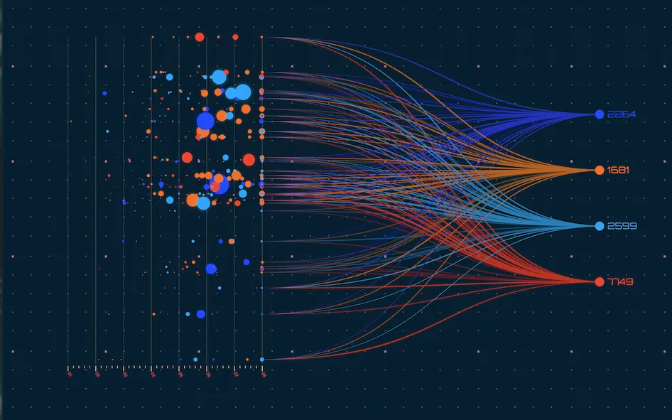
Humans are busy creatures, jumping from one task to another, performing with the utmost productivity and not wanting to waste a single second. Probably that�s why we want to make quick choices and decisions. This in turn requires us to look at large amounts of relevant and detailed data for decision making in a short period. Data Visualisation is a statistical tool that makes this possible for us.
Data Visualisation is the mechanism of representing data in any visual format such as a bar graph, histogram, pie chart, scatterplot, streamgraph etc. The relationships between sets of data are communicated through images.
But how is it even beneficial?
Data Visualisation provides us with a visual summary of the information, hence making it easier for us to identify patterns and trends. When data is visualised, it is much more valuable and useful. Humans have an innate tendency to understand data and facts in pictorial formats. It�s just how the human brain works. It helps us gain insights and analyse large chunks of data in minimal time.
Now, how is it used?
Data Visualisation can be used to perform various tasks such as determining frequency, determining relationships and correlations, examining a network, scheduling, analysing value and risk etc.
Types of Data Visualisation Charts
Different types of Charts perform different, yet specific roles. It is very necessary to pick the right Visual Tool for a given objective. The various types of charts include-
Line Charts: These are used to represent changes in data over time.
Area Chart: This is a variation of the h element as a part of the whole. It is the best to compare proportions.
Gauge: It is used to represent the distance between two intervals.
Map: A lot of data used in business decisions are location specific, hence a map can be used to illustrate the data effectively.
Frame Diagram: They are tree maps used to represent hierarchical relationship structure. The Diagram consists of various levels segregated using branches.
Thereby, this form of infographics can transfer data into critical insights for growing businesses and allow the decision maker to make intelligent and easy calls.
Comments

Leave Comment
Latest Posts


Explore Topics
No Comments ...